The elements of INSO's visual identity
Welcome to the INSO brand portal
This online repository provides guidance and practical advice to help staff correctly apply INSO branding standards in their work. It has all the resources you need to design and develop digital, print and other visual material. Discover logos, visual identity components, templates and the guidelines of their usage.
For further guidance, send a message to communications@ngosafety.org.
Updated donor logos
Donor logos have been recently updated! Check the downloads section for new and updated Donor Logos, collages and related resources.
Main logo
The INSO logo is our visual signature and the cornerstone of a unified visual identity. For many audiences, the logo creates a first impression of INSO’s work. Therefore, it is important to use the logo correctly and consistently for printed material and on the web.
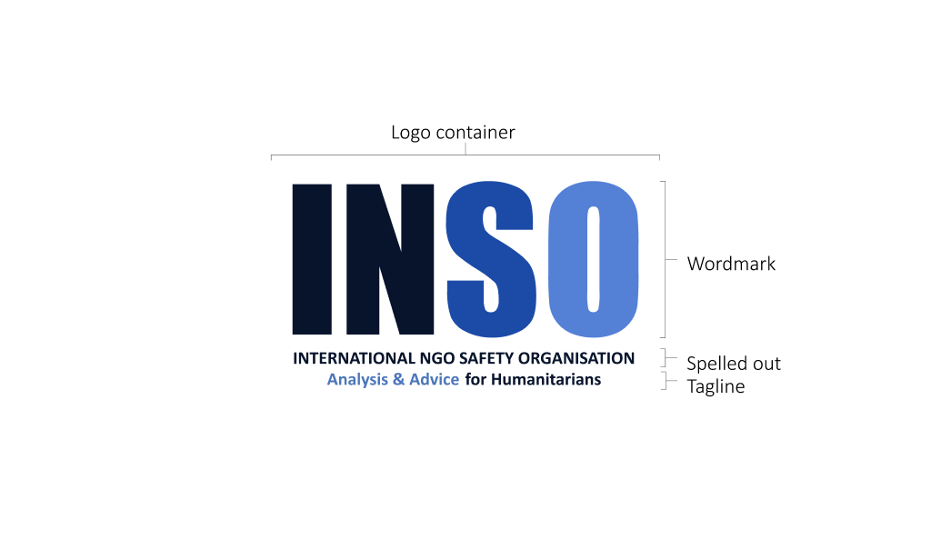
Logo formats and usage
Full format
In situations where INSO is not well known, use the logo with the organisation’s name spelled out in full with the tagline. Take into consideration that this version will only work in medium and large sizes, otherwise the text will not be readable.


Spelled out medium format
In situations where INSO is known. For example, in external usage within the humanitarian community. You can use the logo with the organisation’s name spelled out in full while taking in consideration that this will only work in medium and large sizes, otherwise the text will not be readable.


Wordmark – Minimal format
In situations where INSO is well known. For example, internal usage within the organisation or usage of more than one copy of the logo in a single document. Or on the first slide and last slides of a powerpoint presentation or the footer of a word document.


Black / Negative
Only to be used where there is no full-colour option possible. For example, in a black-and-white newsletter or magazine or where multi-colour printing is not available. As shown in other versions, this one should always be used with the white background.
Logo usage
Keep the original proportions when you resize. Tip: Use the ‘shift’ key while resizing.
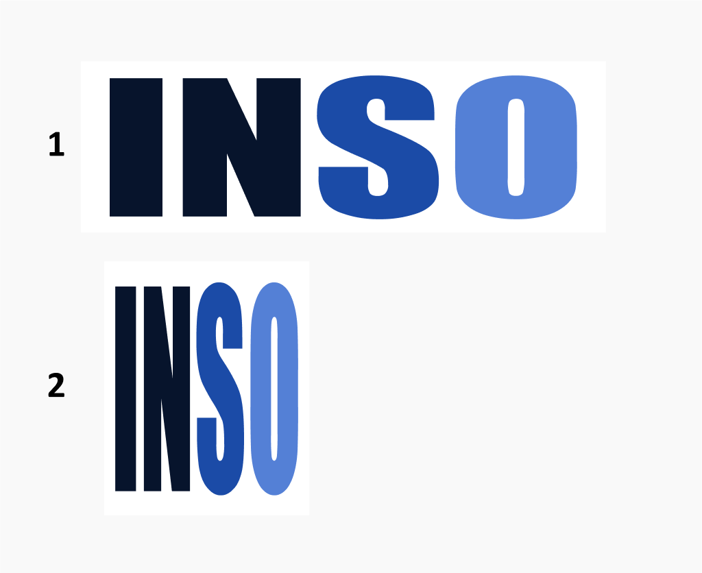
Change the shape of the the logo by stretching (1) or squeezing (2).
Use the logo in its original colours, or in black or grayscale if needed.

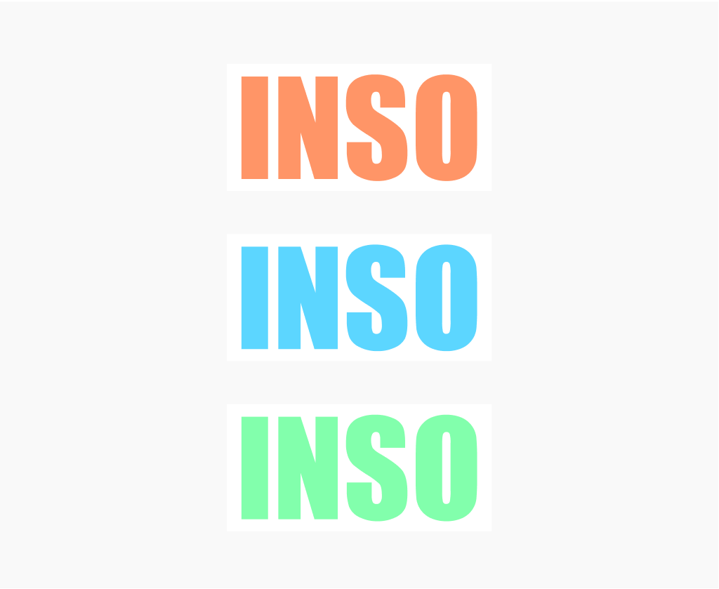
Change any of the colours in the logo, including the colour palette available in this portal.
Always use the logo with the white container background.
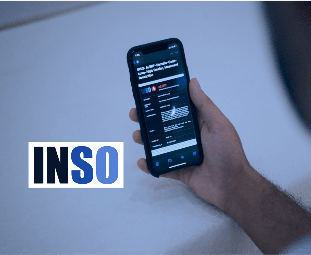
Remove the white container from the logo, especially when used with images.
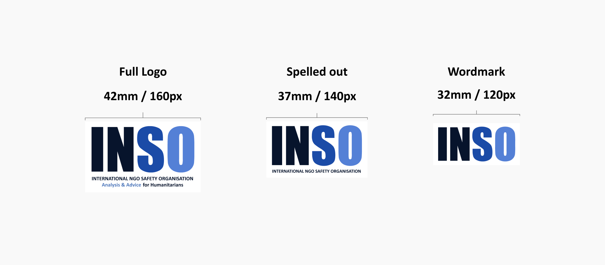
Size instructions
The INSO logo should always be presented in ways that enable maximum clarity and readability. To guarantee that the logo is legible in print and in digital media, always respect the following minimum sizes.
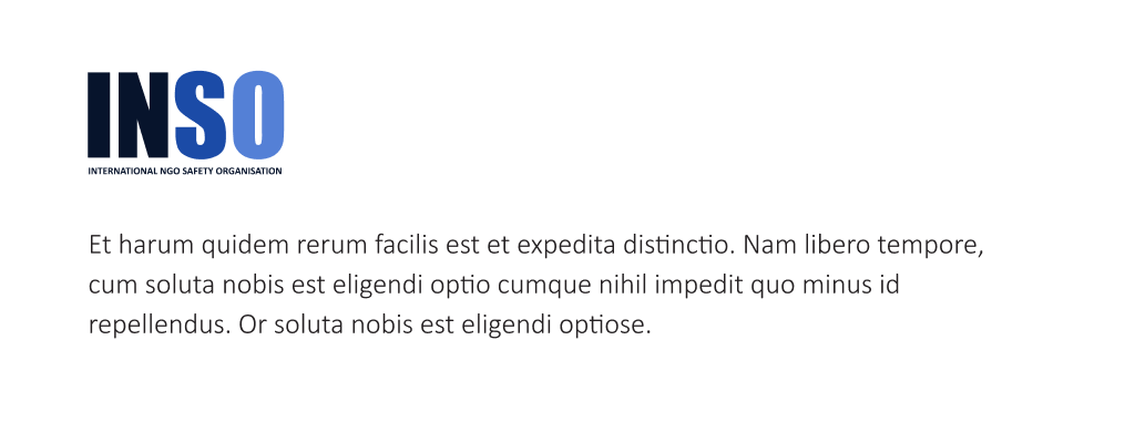
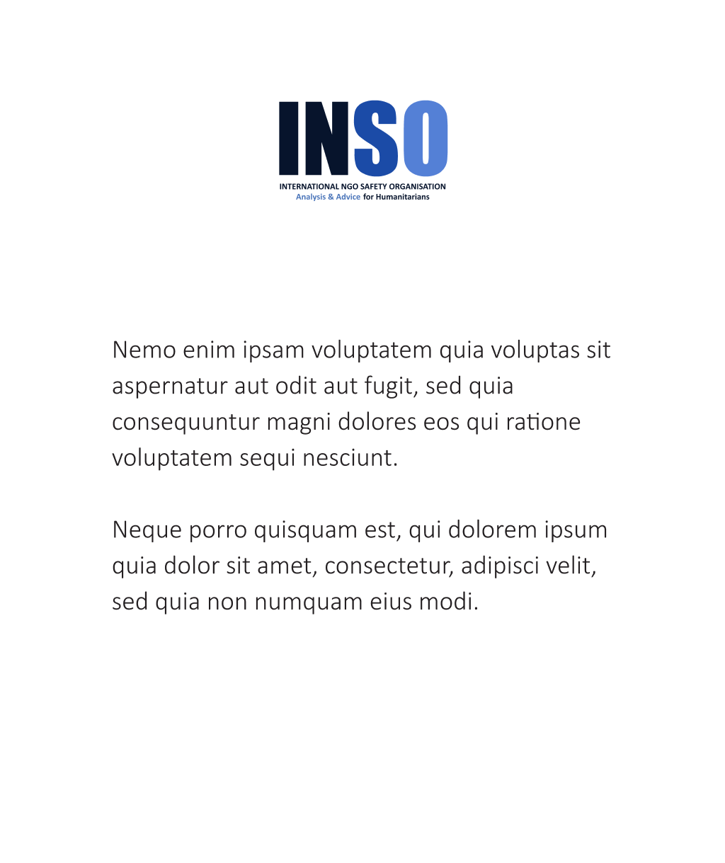
Logo placement
The logo should always have adequate blank space and balanced margins around it. If used as a header or on a cover page, use the full format. Use the medium format for letterheads and the wordmark to bookmark pages or in the footer.
Logo application
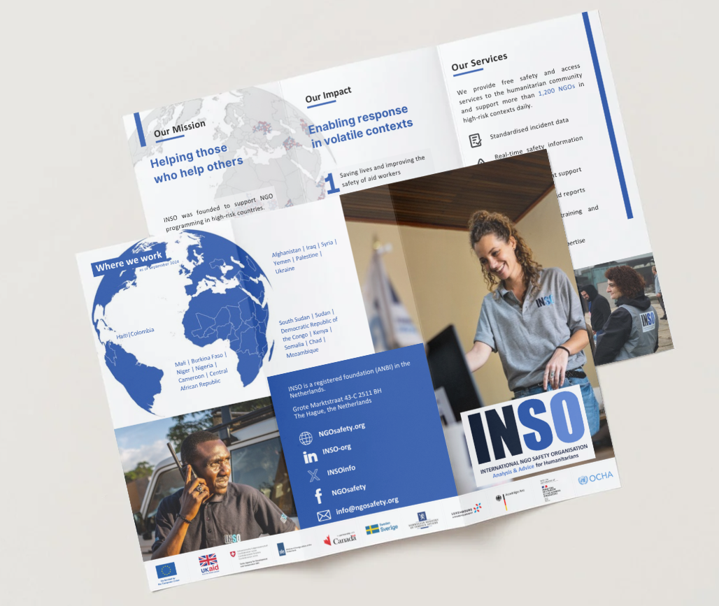
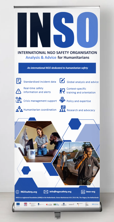
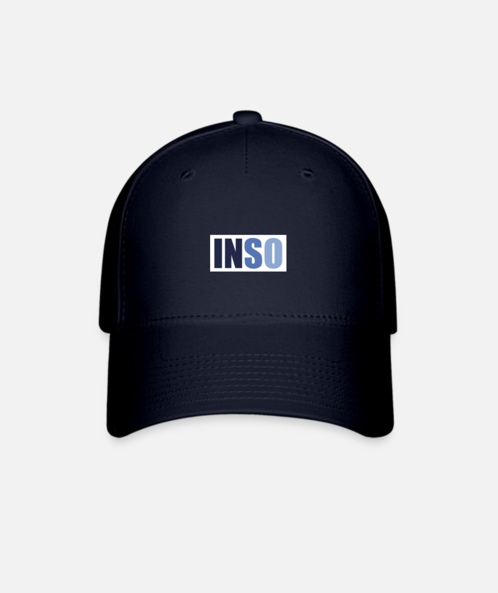
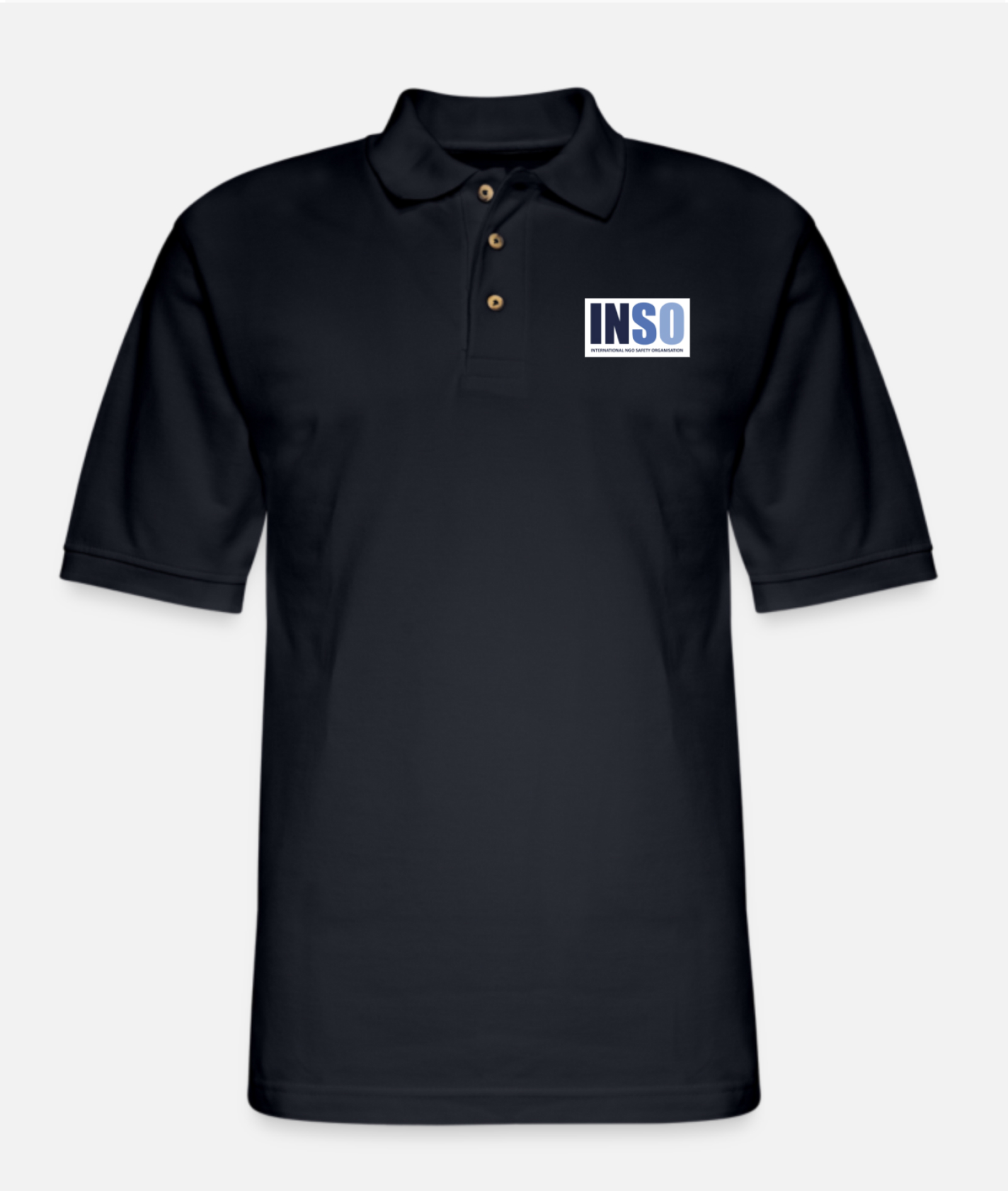
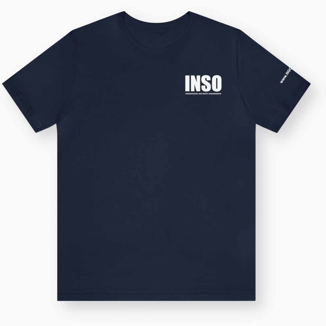
The following are examples of how you can apply the logo to your products and merchandise. Templates, design files or mockups of these items are available on request. If you need to create something for your country office (for example, ID cards or business cards), contact communications@ngosafety.org, as it is likely that a template already exists. Avoid creating ad-hoc designs without consulting Communications.

NGOsafety.org
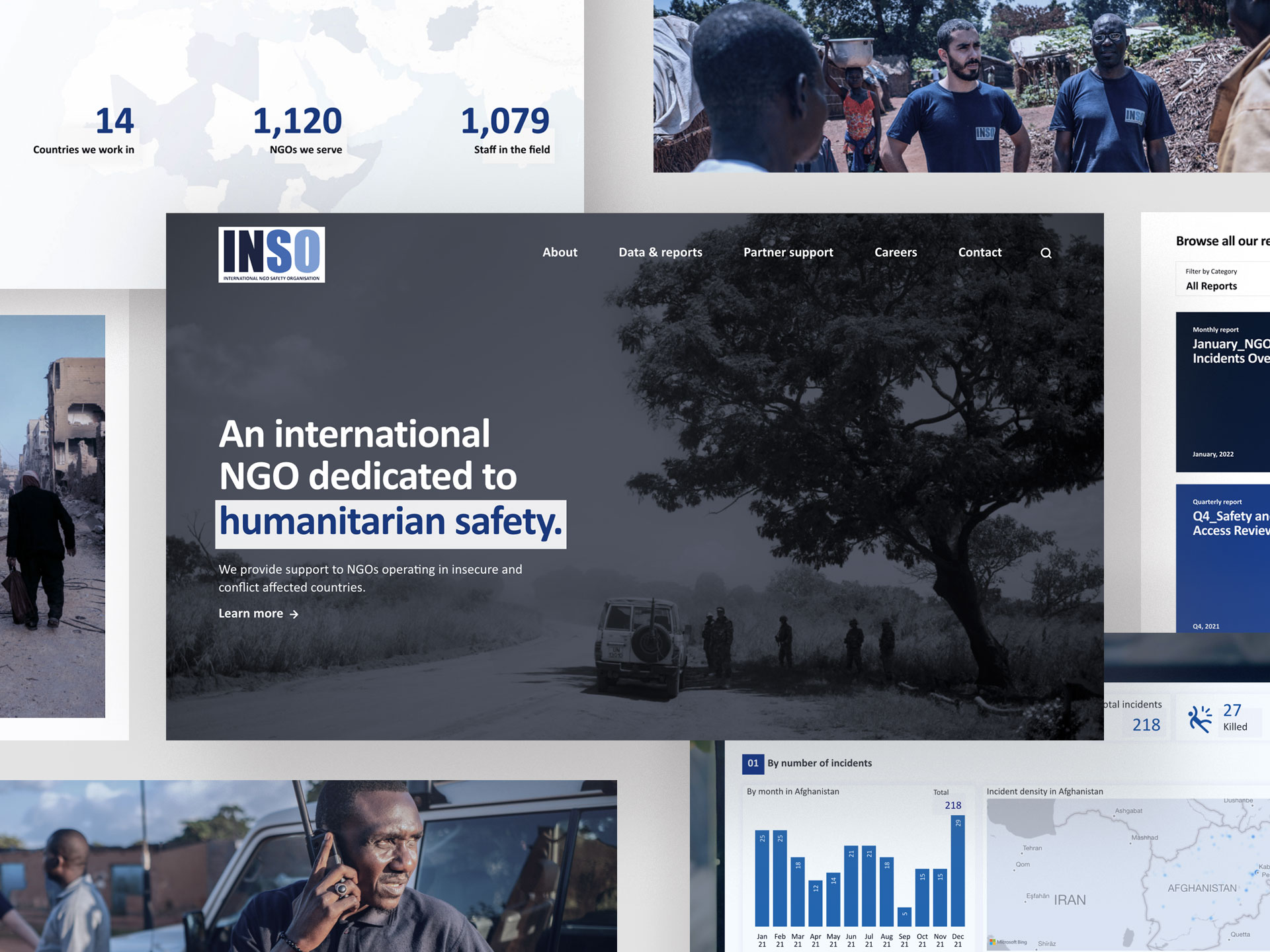
Our official website, NGOsafety.org, exemplifies correct brand application. It should be referred to not only for information but for guidance and inspiration on INSO brand standards and design.
Donors logos & applications
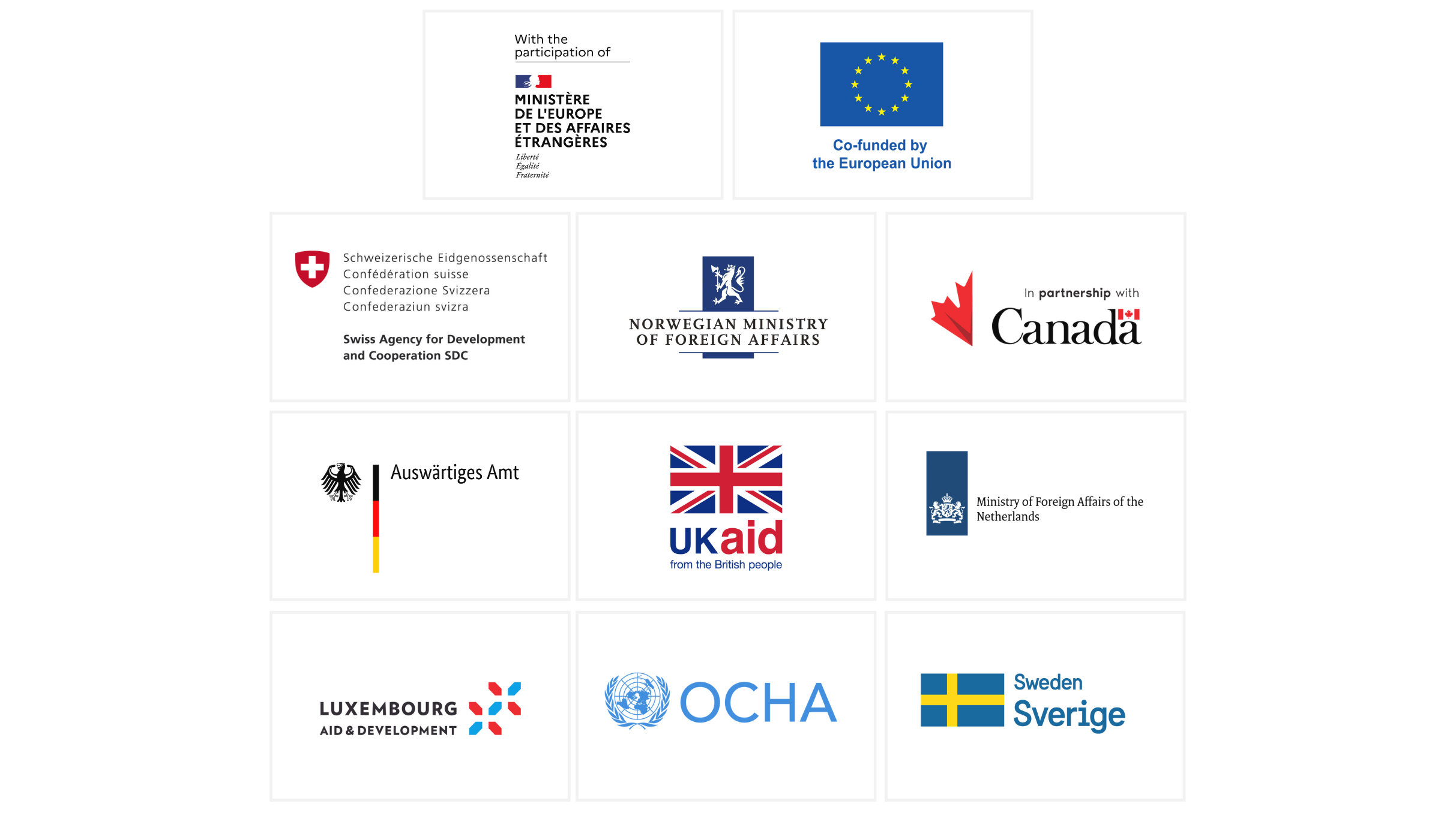
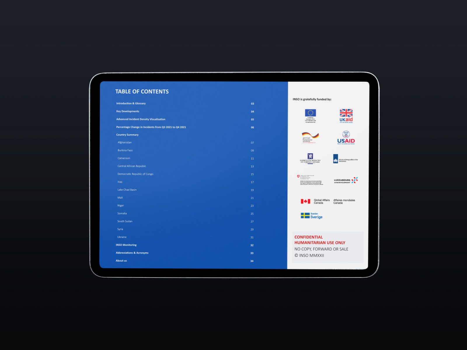
Accurately and appropriately recognising our donors is not only important but a contractural obligation. As with the INSO logo, do not stretch or spread the logo, or change the colours. Make sure that all donor logos are equally sized and presented in balance with the INSO logo. If you have questions about applying donor logos or donor visibility requirements, get in touch with the Grants team.

Typefaces (Fonts)
The typefaces we use reflect our personality and clear communicative approach. We selected them on the basis that they are highly legible, balanced, complement each other and render effectively over all platforms and media
Calibri
We use Calibri as main typeface for all content. We have chosen Calibri as it is easy to read and widely available. While relying on the bold version for titles and links, to assist readability we use Calibri light for body text such as the one you are currently reading.
Tip: It is best to avoid Calibri regular in blocks of text, and use Calibri light instead.
Arial
We use Arial as a fallback typeface only if Calibri isn’t available. You might experience this in systems where font selection is limited or uncustomizable.
Colours
The primary core palette comprises of our signature blue and highly legible black, with shades of grey. The dark blue is mainly used for background elements or/and as secondary accent colour. The light gray is used in backgrounds in alternation with plain white.
INSO primary blue
Main brand accent colour used in action buttons or in support graphic elements.
INSO dark blue
Used as background colour and as accent colour in combination with the signature blue.
INSO black
Main text colour.
INSO light gray
Used for all background elements with text or visuals.
Icons
Iconography can simply and effectively visualise content or explain a concept. These icons have been chosen for their clear, simple design. You should always be consistent in the use of icons – do not use the same icon to explain different ideas within one document.
Photography
We use images from many sources but are selective so that all our photographic imagery is consistent. We avoid clichéd ‘stock’ photography in favour of authentic scenes, interesting perspectives and captured moments. All photos that we have collected are with the written consent of people who are recognisable. Wherever possible, you should use INSO’s owned photography. You do not need credit any of the images in our photo library.

Submit your own
Do you want to add photos from your country office activites or services to INSO’s library? You can submit these for review to communications@ngosafety.org. Be ensure to get written consent for anyone in the photos who is recognisable.
Tone of voice
Clear
Our information is easy to understand. Our vocabulary is simple and graphics tell a clear narrative.
Professional
We are a highly trustworthy organisation that is working to protect those who protect others.
Reliable
We treat information and data with respect, and where necessary, confidentiality. Our teams can always be relied upon in a crisis.
Discreet
We educate our readers about the realities for NGO workers in the world’s more volatile contexts, without being alarmist or inflammatory.
Informed
Our presence on the ground in the world’s most volatile contexts gives us the data and authority to speak with confidence.
Download our brand assets
You can download our approved brand assets in various formats below. These can be used in conjunction with the guidance given to produce branded materials and communications for INSO.
If you have any questions or additional requirements, please contact communications@ngosafety.org
